Product Experience of Password Creation
Case study, referencing Entytle
The goal is a world where Entytle's B2B customers experience effortless access to the Insyghts. This leads to deeper engagement, increased adoption, and greater ROI. A key moment in this experience is when a user forgets their password and needs to reset it. The aim is to ensure this process is smooth and frustration-free, directly impacting customer satisfaction and future engagement. Imagine avoiding that "forgot your keys with an urgent need to use the bathroom" scenario.
Summary
💖 UX objectives
Minimize friction. Challenge the norm, but don't reinvent the wheel.
⚖️ Potential conflicts
It should feel simple yet clear to the users what happened and what to do. Be clear and concise, but also friendly and approachable.
✨ Special UX requirement
Users should be informed and fix errors while typing, instead of done typing (live vs on-exit validation).
😇 Persona
Users generally don’t like to read. They are vulnerable to digital tasks, often need crystal-clear instructions, and are highly likely to bounce when hit by blockers.
If short on time, check the video for quick overview
Chapter 1
Knowing Why & What.
Entytle's customers who us Insyghts are primarily sales managers, and it's pivotal to craft a positive impression and build trust immediately upon onboarding.
Onboarding Redesign
Part of the larger initiative of improving Application onboarding
Improving accessibility
Current form design does not meet WCAG standards
Guided Setup
The flow would lead to a guided setup experience for the Insyghts.
Why it is important?
Complicated password resets can be a big hassle:
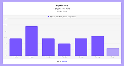
7 monthly requests
Mixpanel analytics show 7 users went to 'forgot password' in the last 6 months.
660
min / year
11 hours wasted.
due to frustration during password creation, which is the result of poor guidance.
Unlike B2C products that can rely on Google or Microsoft, B2B platforms require internal authentication via email and password, placing even greater emphasis on a smooth, secure, and user-friendly password experience.
Chapter 1 - What
What others are doing ?
I audited over 20+ B2B enterprise forms, detailing everything from error states, password field components, and more. Making a password can sometimes take too long, and I wanted to craft an experience that isn't aggressive and can be seamlessly done quickly.
A great onboarding experience incentives customers to continue using our product.

Best-in-class form examples audited
Chapter 2
Knowing Where & How
From user behavior and internal testing, i found the following 3 issues with the form. Understanding each and solving each one by one will prioritize the UX and simplify the experience.

Current Password Form
Requirements
Due to "on-exit validation" the form throws errors, which appears as a mistake compared to an instruction.
Show/Hide
Users make mistakes, no validation is a big risk for passwords
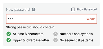
Strength
How strong is password?
Chapter 2- How
How to solve "Requirment"
Requirements
Due to "on-exit validation" the form throws errors, which appears as a mistake compared to an instruction.
A simple solution to this is to limit requirements and make them visible, fewer rules for the user to process, making password creation faster.
With complex requirements, users make up a compliant password on the fly, adding characters and symbols until it’s valid. And at that point, it’s not so much the user’s password, as it is a random string that fits this system. Making matters worse, that string is hidden from the users as they invent it, because most passwords are masked.
If they want to remember what they ended up with, people will have to carry that information in their short-term memory, as they create it, thus increasing their cognitive load.
Try 1 - Showing the requirements

Pro: full clarity up-front. Checking off each one feels okay, but can be satisfying by improving visually.
Cons: text-heavy and challenges users’ attention span.
The cons can be solved with adjustment to the copy
UX Copy
I decided against using language such as ‘your password must contain’ as it would sound mandatory. Instead, I tried other options to improve their password security, by using text such as ‘Strong password should contain...’ so it sounded more like a motivating while maintaining a professional tone, encouraging users to improve their passwords without sounding forceful.
Copy
It's better to have
Create password that's
To be secured use
Better passwords have
It's recommended to contain
Tips for a stronger password
To make your stronger password
Strong password should contain
Stronger passwords have
Emotions
😐 🤷♀️ Neutral or indifferent
😕 Incomplete or vague
😬 🗣️ Slightly authoritative but awkward
👍 💭 Encouraging but passive
👩🏫 📄 Advisory but impersonal
🙋♀️ 📚 Helpful and educational
🤯 ❌ Confusing due to grammatical error
✅ 👨🏫 Clear and instructional
😃 🚀 Positive and motivating
"Strong password should contain", as it aligns with the need for clear, authoritative instructions in an enterprise setting where security is paramount.
Requirements Copy
Existing
Minimum 8 character
1 uppercase
1 lowercase
1 number
1 special character
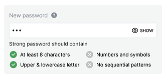
Finalised on UI
At least 8 charcters
Upper & Lower case letters
A symbol
No sequential patterns
Chapter 2- How
Improving requiremnets visually
A seemingly simple component that turned out to have many parameters that heavily affect the experience. Below are some insights and design decisions I thought through to attempt to achieve a great experience.

Explicit

Implicit

Which one Explicit or Implicit with password requirements?
Being explicit with the requirement provides clarity but can also take more effort to process. being implicit allows for a simple interface and gives customers more flexibility but is also vaguer
Ultimately, I prioritize clarity over simplicity - also given the constraints of time and potential ML/AI models needed for a password strength bar.
Icon Selection
The initial icon chosen was both not accessible and had too much contrast not feeling like an initial state. I ended up going witha lighter shade and an 'x-mark' icon as it felt most opposite of a 'checkmark'
Icon choices for unmet requirement:


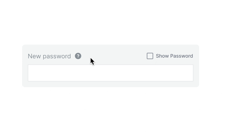
Safer Initial States
This new initial state is much less aggressive and is clearer to the customer that they need to meet the requirements listed. Research also shows that the length of the password matters more than the requirement listed.


Designing Error States
When designing for error states, I had to balance a decision between extending the form height to accommodate the error state captions or indicating with just a color change. after testing the interactions, I decided that the extension of the form would be helpful for accessibility given that the animation of the caption and form height extension would indicate a change in state.
Chapter 2- How
Add "Show/Hide"
Show/Hide
Users make mistakes, no validation is a big risk for passwords
Allow password unmasking
Seeing the password will support memory and will allpw users to check their work.
Another downside to masked inputs is that they cover up typos, which the user may not have detected. This is particularly important given that many users create passwords from their mobile devices and tablets. Not surprisingly, research shows that users have more errors when typing in passwords on smaller devices than on desktop computers (Von Zezschwitz, 2014).
This can be done in 3 ways
1. Eye Button
2. Eye + Text Button
3. Text button
The Eye Icon Dilemma
There are a number of variations of the the "unmasking eye" icon but they mostly have the same issue, below are some examples:
The problem arises from the inconsistent use of this icon across different platforms.

Adobe Creative Cloud uses an open-eye icon to indicate that the password is visible. When the user clicks the icon, it changes to a closed eye, indicating the password is hidden.
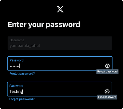
X uses an open-eye icon to indicate that the password is hidden. Clicking the icon reveals the password and changes the icon to a closed eye.
These conflicting implementations can be confusing, especially for users who frequently switch between different services.
Solutions to the Eye Icon Issue:

Swap Icon with Text
Supplement with Text

Consider Checkbox button
Choosen "Checkbox"
Checkbox is best solution because:
Clarity and accessibility
The text "Show password" is more explicit and easier to understand for all users, including those who may not be familiar with the eye symbol. This approach removes ambiguity and enhances user comprehension of the functionality.
Avoiding potential confusion
The eye icon can sometimes be misinterpreted, as users may not be sure if it represents the current state of the password (visible or hidden) or the action that will occur when clicked
Security considerations
While allowing users to view their passwords can be helpful, companies want to ensure this feature is used intentionally. A clear text option will encourage more thoughtful use of this feature
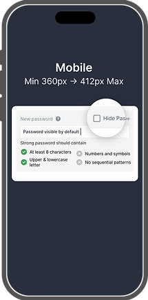
On mobile, unmask passwords by default, but add a “Hide” option. It’s especially hard to type a complex, secure password on mobile.
Unmasking passwords on mobile is not really hurting security very much. Mobile keyboards indicate exactly which letters were typed, anyway.
On desktop, mask passwords by default, but add a “Show” option so that people can remember the password and check their work.

Detailed password composition requirements force users to jump through what feels like arbitrary hoops. People comply because the site forces them, but they end up creating easily guessable phrases. Satisfying the requirements does not necessarily result in secure passwords when real humans are making them up just to get past the registration screen.
Chapter 2- How
Add "Strenght Indicator"

The Solution: Motivate people to create better passwords by showing how secure the password is.
A study by Egelman et al. (2013) found that stenght meters motivated users to create stronger passwords
Moreover, reaching the full green bar adds a modicum of satisfaction in an otherwise joyless task: a nice example of gamification used for good.) In general, focusing on the benefits is an effective way of persuading users to use your products or services
I aimed to give the user a sense of progress and create a feedback loop — an immediate indication for every action they performed. For this, I examined various types of bars and meters. Another benefit the users gain here is a certainty about what remains to be done to achieve a strong password.


Visual Tries
T1


Pro: looks clean and simple.
Con: Complext to implement and colides with error state
T2


Pro: Supports visually with satisfaction of achiving
Con: Technically checking the conditions from backend can be costly if applied for large userbase.
Chosen "Progress Bar"
Familiarity and Simplicity
Users are accustomed to progress bars in various contexts, making it intuitive and easy to understand.
Incremental Feedback
As users type, the bar fills dynamically, encouraging them to improve the password until it reaches the "strong" zone.
Colour Feedback
It is easy to show colours gradient from red (weak) to green (strong), providing clear visual cues about password strength.

Proven Effectiveness
Studies show that such progress bar visualizations help users create longer and more complex passwords compared to no feedback or less familiar visualizations like gauges or step indicators.
Encouraging without mandating
Another aspect of this feature was a small indication that appears after the user has left the password field. Although it’s a small element, it wasn’t easy to crack. I needed to strike the right balance between letting the user understand they can continue, but also encouraging them to return and create a stronger password.


LEARNINGS & IMPACT
Product Shipped
For the experience to be seamless and easy, designing accessible forms with detailed interactions was key to allowing everyone to fill out form quickly
References & Studuies
Proof of concepts that are applied.
Case Studies
Ethanchng case study on Marqeta
Articles
Real application examples
Hootsuite - Password requirement
Mailchimp - Create account
Google & Microsoft Show Password Button
Adobe & X(Twitter) Eye button